Well after a tiresome long weekend I got some responses from my team
We have 3 pictures so far that you can pick from
Now just bare in mind before you rip us to shreds that this is a mockup IT'S NOT A FINAL IMAGE AND WILL HAVE TO BE RE-SHOT WITH BETTER EQUIPMENT
I haven't heard back from some of the people in my team so I don't know what they have done
But I can put up some
 Image 1:
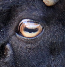
Image 2:

 Image 3:
Marie Walter
xo
Great job! Fits in with the theme really well. I like the eye one the most as it leaves a lot more room to move, that is, the 3rd is a little seedy and the first decadent, whereas the 2nd can be anything? Brett
ReplyDeletei think the first or 3rd is better options cause there is a saying "zipp your lips" but the doors in the eye is a bit ambiguous.. i like the lips idea, and i think we can expand more on it. with a brain storming sesh, but remember it has to go on posters flyers and possibly the tshirts, i that last idea is still in play, so it needs to be simple. not a great work of art :D
ReplyDeleteAt this stage I prefer option 1 or 2. Option 2 could be made into a line drawing / pop art/ outline print etc if need be or would probably look pretty cool printed as a photo on T-shirts. Detail can be enhance if reshot on a macro lens too.
ReplyDeleteCheers T
Of the three images i prefer option 2 the eye with the door cleverly reflected. If the aim was to promote a product in an advertisement the other two would be great.
ReplyDeleteFor the exhibition of photography option 2 draws the viewer in and is a little more thought provoking. With the "secrets behind closed doors" text it will invite the viewer to take a closer look, "art" photography aims to have the viewer drawn in and examine an image to discover its story.
B :)
I like the 1st or 3rd ones
ReplyDeleteI prefer the first image, the second image is too dark, and the door is a bit hard to see so I think the image would confuse people? I think if the second image was photoshopped so the eye was brighter and maybe if the door was in colour and the rest was in black and white it would be much better because it would be easier to see the door...this is important especially because for the flyers and the t-shirts the attention needs to be grabbed more. Also I think the first image is better because the way that it has been designed the texture around the zip draws the attention to that focal point. Also the zip is a bit more relevant to the word "secrets" then the door...I mean the phrase "behind closed doors" is just the byline, i think more attention should be brought to the actual theme.
ReplyDeleteHI,
ReplyDeleteThe eye one was just a test piece with an eye (not macro shot) and a door image. It would be clearer in final print and we were considering making the door red to make it stand out. Mostly the concept.. not a final product.
Cheer T