Hey that looks pretty crisp, i like it - Andre
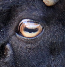
I like it. Especially the reflection in the pupil. I think the b&W eye looks more stylish and would work better in print.Good workTania
thats some good stuff :)- Kassidy
thanks guys, yeah that reflection is actually on my eye, i just faced an open window when i took to photo.what about the font?is it easy to understand?

Hey that looks pretty crisp, i like it
ReplyDelete- Andre
I like it. Especially the reflection in the pupil. I think the b&W eye looks more stylish and would work better in print.
ReplyDeleteGood work
Tania
thats some good stuff :)
ReplyDelete- Kassidy
thanks guys, yeah that reflection is actually on my eye, i just faced an open window when i took to photo.
ReplyDeletewhat about the font?
is it easy to understand?