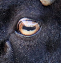
I have a suggestion well kind of like a rough idea for a logo although I'm not in the graphics team, I hope this can be an idea for them to work on! So I happened to come up with this image using stock images from the internet. I photo shopped this myself and I know it might not be 100% but its a rough idea :) this is just a suggestion to the graphics team and for everyone else to think about... So give some feedback cos it'll be great :) and also HAPPY EASTER !! enjoy your holiday break :D
TY
Kassidy (location team)
1st idea
with door

2nd idea
without the door

3rd idea


Good stuff, progress is good Kass
ReplyDeletelemme know if you need some stock to work off, and I'm sure the rest of the class will be willing to help out aswell :)
-Dylan
This is pure - I thoroughly love the 1st and 2nd logos :-)
ReplyDeleteTop notch.
Ashleigh Wilson.
I quite like it =]
ReplyDeleteI shall look into something like that!
Great job
Marie
xo
GDAY MATES... i think those are pretty swell, some progress is being made perhaps. i like the door idea but maybe on the closer picture? anywho im off to eat some donuts and ride my dogsleigh team to my igloo! cheers!
ReplyDeleteGraham - managemento
yep im liking these images you have Russelled up
ReplyDeletewe will definitely be taking these onboard
- Tj
good work guys, the logo's are looking great :)
ReplyDeleteI'll be voting for the 1st one fo sho!
-Olly
the close up one with the door would look great
ReplyDeletetania
I agree with Graham, the door in the first image with the eye in the 3rd would look good
ReplyDeleteHenry
Pretty much everyone has said they like the first two and I agree...the 3rd doesnt exactly have enough of the eye in it to make it more of a "neat" logo. But yeah, I think I like the first one the most.
ReplyDeleteJason Z
I like the second one, without the door..
ReplyDeleteJust feel that having the text "Behind Closed Doors" and then also having the girl behind a half closed door might be too much emphasis on the door. To me, the eye and the reflection in the eye, already gives the impression that its something secretive...
But I like both images 1 & 2.
Compliments to the team.
GREAT feedback GUYS! hopefully this has been seen by most of the graphics team??
ReplyDeleteidea for logo? feedback has been based on the 1st and 2nd choice but its up to the group if they wanna do an idea as such :)
Im glad i could help the group out!
i think they all look great :) i really like photo 2...isnt the girl in the eye from the cover of one of evanescences albums?
ReplyDeleteawesome work :)
- Mel Ball
yeah it sure is lol all stock images from the net.. :)
ReplyDelete-Kassidy